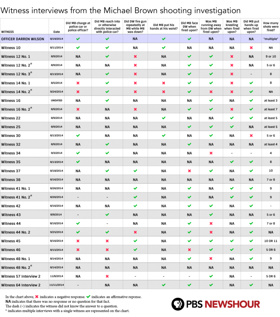
I had posted this in a comment on a previous thread, but I felt it warranted its own post. PBS NewsHour has an excellent chart outlining the similarities and differences in the 29 witness statements NewsHour reviewed.
Here’s the chart.
Here’s a breakdown of the witness accounts.
The chart above doesn’t reveal who was right or wrong about what happened that day, but it is a clear indication that perceptions and memories can vary dramatically.
Here’s a breakdown of the data we found:
- More than 50 percent of the witness statements said that Michael Brown held his hands up when Darren Wilson shot him. (16 out of 29 such statements)
- Only five witness statements said that Brown reached toward his waist during the confrontation leading up to Wilson shooting him to death.
- More than half of the witness statements said that Brown was running away from Wilson when the police officer opened fire on the 18-year-old, while fewer than one-fifth of such statements indicated that was not the case.
- There was an even split among witness statements that said whether or not Wilson fired upon Brown when the 18-year-old had already collapsed onto the ground.
- Only six witness statements said that Brown was kneeling when Wilson opened fire on him. More than half of the witness statements did not mention whether or not Brown was kneeling.


Ridiculously bad chart
They counted witnesses more than once
They left out very obvious things which could be proven by the autopsy such as whether he was shot in the back or the front.
And they plastered the whole chart with a bunch of N/A nonsense. If they didn’t know whether some specific detail happened or not then they are not claiming to have witnessed it. The answer is no not N/A
PBS should be ashamed of themselves for this shoddy piece
Their Chart is also only 46% accurate. I read all of the witness statements over the weekend and the PBS chart over simplifies the answers provided by witnesses greatly, so as a result the fields don’t represent what was actually described.
http://imgur.com/eNdviOl