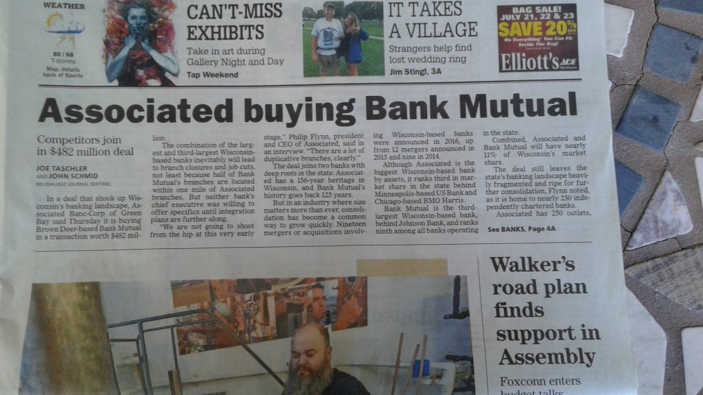
What are you guys thinking? It’s bad enough that the daily print edition is constantly shrinking and that there seems to be less and less editing of content. But don’t give up on good design yet.

But this headline is egregious, and I don’t mean the content. That typeface is awful…isn’t consistent with the rest of your paper…and isn’t the most readable choice available. Just stop it!
And then there is this:

I understand that US Today is trying to do some corporate identity branding here but this design is awful. First, many national chains are starting to work back toward localization while you are working toward homogenization. But even if that’s the correct direction for the newspaper chain…this is the best a multi-billion dollar group can come up with? First it screams CHEAP…and then it screams we love 1970s mass media design. It really isn’t 21st Century by over 40 years. My goodness.
Milwaukee has a reputation for good advertising and logo design and this is the best you have to offer?
And yes I do have a little knowledge of this…I studied ad design and typography in the aforementioned 1970s so I remember this nonsense.


My question is why are you still giving that right wing rag your money>?