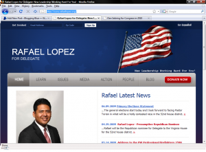
Take a look at these screen captures of two campaign websites, and tell me what you notice.
We’ll start with the website for Republican Dan Sebring, who’s running for Congress here in Wisconsin’s fourth congressional district:
Now take a look at the website for Rafael Lopez, another Republican who just happens to be running for office in Virginia:
Did you notice the drastic difference between the two websites? If you didn’t, don’t worry; there’s not much difference between the two. They seem to be essentially the same cookie cutter website, which makes me wonder if it’s safe to call Dan Sebring the “cookie cutter candidate” here in the fourth district.
Edit: As an interesting (though unrelated) sidenote, this is Blogging Blue’s 1,000th post.


I like how the flag draws your eyes to the right (heh), leaving you less interested in the photo of the actual candidate, but certain that the candidate will pursue and uphold proper American values.
Heh….good call, Jason! Overall, I think it’s a rather poorly done site. I’m not a fan of the huge waste of space at the bottom of the page, and I’d expect better from a Congressional candidate.
Congrats on 1,000 posts!
Thanks Rich.
Do you expect better from Gwen Moore?
I expect better from any candidate. It’d be nice to see some originality, instead of just running with whatever campaign website is fed to the candidate by the powers that be.