Curious about the stimulus money and where it is being spent?
In a move towards even greater transparency, the Federal Government has launched the novel GIS (geographic information system) mapping & database website Recovery.gov that allows you to look at the funds being spent at the state level all the way down to the zip code level. The website allows you to filter by type of spending (contract, grants, loan), by who issued the item and by amount. The number one issuer at the Federal level was the Dept of Health and Human Services.
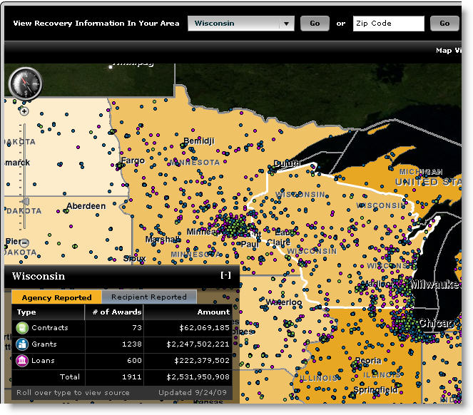
Here’s the status of our share of the pie by each of the three types of spending:
- Contracts – $62 million
- Grants – $2.25 billion
- Loans – $222 million
Here’s a screen shot of Wisconsin’s share of the goodies and the link for you to investigate the state’s receipts.

According to Computer World, the maps were created using GIS mapping software from ESRI. The site is administered by the Recovery Accountability and Transparency Board. The data is available for downloading in an .xml format that can be mashed up and analyzed in a number of other ways.
Recovery.gov states that the estimates on the number of jobs created and saved will be released between October 12th and 30th.
I wonder how the GOP Congress and Governor’s Sanford, Jindal and Perry will handle this one? Residents of their districts and states will be able to see where the money is going and understand a bit more about the basic economics for the stimulus spending plan, including the number of jobs saved and created.


You said it: “share of the goodies.” Number of jobs saved and created? A few government jobs that are short term projects. What happens next year when the money runs out? Well, what’s another trillion, right?