I am an interested amateur when it comes to questions of economics. I have read a lot and talked to actual economists from time to time (I maintain a regular correspondence with a few), but I have no formal training beyond my background in statistics and social science and one macroeconomics class.
However, there are those out there who do have the training. Some of them actually focus on what’s happening with the Wisconsin economy. One of these brave souls is economist Menzie Chinn, Professor of Public Affairs and Economics at the Robert M. La Follette School of Public Affairs, University of Wisconsin – Madison. Professor Chinn has kindly done the heavy lifting of the employment figures to create a comparative view of what the new Walker numbers mean in context. As we learned yesterday, Walker’s numbers mean very little standing on their own. What they need is a comparative context to see how Wisconsin is performing against other states and the nation.
I’m going to snip a bit out of his post this morning, but I suggest you go read the whole thing to get the full scope, the depth and breadth of Governor Walker’s mendacity.
Observations: of December 2011, implied NFP employment is 11.7 thousands above January 2011 levels. Taking into account sampling uncertainty, employment is as little as 5.2 thousand, and as much as 18.3 thousand above 2011M01 levels. The implied NFP employment is 35.4 thousand below Walker’s implied target for NFP growth, taking into account actual government employment and a smooth path for private employment growth.
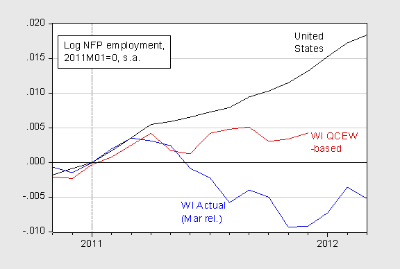
One can place the revised series in a national context. Figure 3 presents a plot of the actual BLS NFP employment series, the QCEW-based series, and the US NFP employment series.

In other words, even with the numbers provided by Governor Walker’s Administration, historical correlations between the NFP series and the QCEW show a lackluster performance in the Wisconsin labor market, with employment essentially stagnant since April 2011.
By the way, other indicators suggest lackluster economic activity, so I do not understand the Administration’s assertions of growth through end-2011. The Philadelphia Fed’s coincident index indicates that economic activity was essentially flat going from 2011M01 to 2011M12. BEA also reports 2011Q4 Wisconsin total income growth placed it in 50th place out of 50 states.
This last point, that other data support the assertion that Wisconsin’s economy continues to suffer, is perhaps the most important. Scott Walker’s thinly veiled attempt to hoodwink the voters with out-of-context data is just so much political theater. There is no substance to them. They are an illusion.


Recent Comments